Featured Answer: An option chain is a comprehensive matrix displaying all available Call (CE) and Put (PE) option contracts for a specific underlying asset across various strike prices and expiries. It highlights crucial metrics like Open Interest (OI), Change in OI, Volume, and Implied Volatility (IV). Professional traders use the option chain to gauge market sentiment, track institutional positioning, and identify key support and resistance levels.
Quick Facts Box
- An option chain lists all active Call and Put option contracts for an asset.
- Open Interest (OI) shows the total number of active, open derivative contracts.
- Change in OI tracks fresh positions being built or unwound during a session.
- Call OI concentration typically acts as market resistance.
- Put OI concentration typically acts as market support.
- The Put-Call Ratio (PCR) measures overall market sentiment (bullish or bearish).
- Implied Volatility (IV) dictates option pricing and premium expansion.
- Combining option chain data with price action yields the highest probability setups.
Introduction
Every trader opens the option chain at least once and feels overwhelmed. Hundreds of numbers flashing on the screen, rapidly changing premiums, Open Interest, IV, PCR—it looks impossible to understand.
Beginners often fail because they treat the option chain like a casino scoreboard, guessing directions based on random green and red numbers. Conversely, institutional traders and smart money rely heavily on option chain analysis to track where massive capital is positioned, where retail stop-losses are clustered, and where the market is likely to stall or reverse.
This comprehensive guide breaks down everything you need to know about option chain explained, open interest explained, and how to read option chain data like a professional.
What Is an Option Chain?
Definition
An option chain (also known as an option matrix) is a real-time table listing all listed Call options (CE) and Put options (PE) for a specific underlying asset (such as Nifty 50, Bank Nifty, or individual stocks) across different strike prices for specific expiration dates.
Why Traders Use It
Exchanges generate option chains automatically by matching buyers and sellers through electronic order books. Traders use the option chain to analyze liquidity, gauge market sentiment, spot institutional accumulation, and locate precise intraday support and resistance levels.
Understanding the Option Chain Layout
When you look at an exchange option chain (such as the NSE option chain), the layout is split into two primary halves centered around the Strike Prices:
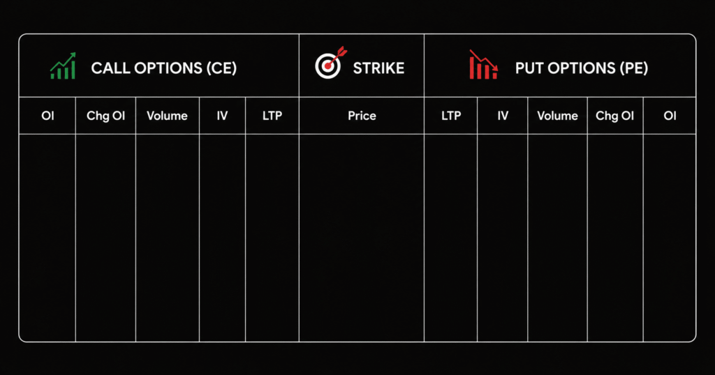
- Left Side (Calls – CE): Contains metrics for Call options, including Open Interest, Volume, Implied Volatility, and Last Traded Price (LTP).
- Center (Strike Prices): The fixed price levels at which options can be exercised. The strike closest to the current market price is called the At-The-Money (ATM) strike.
- Right Side (Puts – PE): Contains matching metrics for Put options.
- Key Columns Explained:
- LTP: The current market trading price of the option contract.
- Volume: The total number of contracts traded during the day.
- OI (Open Interest): The total number of active, unsettled contracts held by market participants.
- Change in OI: The net addition or reduction of open contracts during the trading session.
- IV (Implied Volatility): Measures the expected market volatility priced into the option.
What Is Open Interest (OI)?
Definition & Distinction
Open Interest (OI) represents the total number of derivative contracts (Futures and Options) held by market participants at the end of a trading day.
It is vital not to confuse OI with Volume:
- Volume counts every single transaction executed during the day (e.g., if trader A buys 10 lots and sells them, volume increases by 10).
- Open Interest only increases when a new position is created and held overnight. If an existing position is squared off, OI decreases.
The Movie Theatre Analogy
Imagine a movie theatre with 100 seats.
- Volume is the total number of ticket sales transactions processed at the box office throughout the day (including people buying and returning tickets).
- Open Interest is the exact number of people currently sitting inside the theatre watching the movie right now.
Why Open Interest Is Important
Open Interest serves as the ultimate footprint of institutional market participation. Because institutional investors (FIIs and DIIs) deploy massive capital that cannot be hidden easily, their positioning remains visible through high Open Interest concentrations.
- High OI indicates heavy market liquidity and strong interest at specific strike prices.
- Rising OI combined with trending price action confirms market strength.
- Massive OI clusters act as psychological barriers that dictate where support and resistance form.
How to Read Open Interest Like a Professional
Professionals scan the option chain to locate structural extremes:
- Highest Call OI: Reveals where the maximum number of Call writers (sellers) are positioned, acting as major Resistance.
- Highest Put OI: Reveals where the maximum number of Put writers are positioned, acting as major Support.
- Market Psychology: When prices approach a strike with massive Call OI, writers will aggressively defend their positions to prevent losses, often causing the market to reverse downward.
Understanding Change in Open Interest (The 4 Build-ups)
By analyzing both price movement and Change in Open Interest simultaneously, traders can decode whether smart money is accumulating long or short positions:
1. Long Build-up
- Price: Rising ↑
- Open Interest: Rising ↑
- Market Meaning: New buyers are aggressively entering the market. Highly bullish.
2. Short Build-up
- Price: Falling ↓
- Open Interest: Rising ↑
- Market Meaning: New sellers are initiating short positions. Bearish sentiment dominates.
3. Short Covering
- Price: Rising ↑
- Open Interest: Falling ↓
- Market Meaning: Trapped short sellers are buying back contracts to exit losing positions, driving prices higher rapidly.
4. Long Unwinding
- Price: Falling ↓
- Open Interest: Falling ↓
- Market Meaning: Long position holders are booking profits or cutting losses, causing a pullback.
Option Chain Support and Resistance Strategy
To trade using option chain support and resistance:
- Locate the strike price with the Highest Call OI on the CE side; draw your horizontal Resistance line there.
- Locate the strike price with the Highest Put OI on the PE side; draw your horizontal Support line there.
- Look for Fresh OI Additions during the trading session to see if support or resistance is strengthening.
- When price breaks through a heavy OI strike with high volume, expect an accelerated breakout move due to short covering or long buildup.
Put Call Ratio (PCR) Explained
Formula & Interpretation
The Put-Call Ratio (PCR) is calculated by dividing total Put Open Interest by total Call Open Interest:
PCR = Total Put Open Interest / Total Call Open Interest
- Bullish PCR: A PCR significantly above 1.0 (e.g., 1.3 to 1.5) indicates heavy Put writing, suggesting strong underlying support and bullish sentiment.
- Bearish PCR: A PCR significantly below 1.0 (e.g., 0.5 to 0.7) indicates heavy Call writing, signaling cautious or bearish sentiment.
- Extreme PCR (Contrarian Signal): An extremely high PCR (above 1.5) or extremely low PCR (below 0.5) often signals market exhaustion, paving the way for a sharp counter-trend reversal.
Implied Volatility (IV) Explained
Understanding IV
Implied Volatility reflects the market’s forecast of a likely movement in a security’s price.
- Why IV Rises: When uncertainty, panic, or major news events (like RBI announcements or budget speeches) approach, demand for options surges, causing IV to rise.
- Why IV Falls: Once uncertainty passes, options premiums deflate rapidly—a phenomenon known as IV Crush.
- Trading Implications: Buy options when IV is low (before major expansions) and sell options when IV is exceptionally high.
Max Pain Theory Explained
The Max Pain Theory suggests that option prices gravitate toward a specific strike price at expiration where the maximum number of option buyers (both Call and Put holders) experience financial loss (expire worthless), causing “maximum pain” to option buyers and maximum profit to option writers (sellers). Traders track Max Pain on expiry days to anticipate where the underlying asset’s price is likely to settle.
Step-by-Step Guide to Reading the NSE Option Chain
- Find Spot Price: Identify the current live trading price of the underlying index or stock.
- Locate ATM (At-The-Money): Find the strike price closest to the spot price.
- Find Highest Call OI: Scan the CE column to locate the strike with the largest open interest accumulation (Resistance).
- Find Highest Put OI: Scan the PE column to locate the strike with the largest open interest accumulation (Support).
- Check Change in OI: Identify where fresh contracts are being added during the live session.
- Check PCR: Calculate or view the overall Put-Call Ratio to determine overarching market bias.
- Check IV: Observe Implied Volatility levels to assess whether options are overpriced or underpriced.
- Confirm Price Action: Never trade solely on option chain numbers; always confirm setups with technical analysis and price action.
Common Mistakes Beginners Make
- Using OI Alone: Relying entirely on open interest numbers without looking at underlying price action or chart structure.
- Ignoring Expiry Projections: Failing to account for how rapidly time decay and gamma impact options as expiry day approaches.
- Ignoring IV Crush: Buying expensive options when IV is at extremes, only to watch premiums collapse even when the market moves slightly in your favor.
- Overtrading: Changing trade direction every time 15-minute Change in OI numbers fluctuate slightly.
- Following Social Media Tips: Acting on unverified option chain screenshots shared online without conducting personal analysis.
Practical Example of Option Chain Analysis (Nifty)
Imagine Nifty is trading at a spot price of 22,000:
- Highest CE OI: Located at the 22,200 Strike with 1.2 Crore contracts (Acting as heavy Resistance).
- Highest PE OI: Located at the 21,800 Strike with 1.5 Crore contracts (Acting as heavy Support).
- PCR: Stands at 1.25, showing mild bullish bias.
- IV: Moderate at 13%.
- Trade Idea: Because Nifty is holding above 21,800 support with a supportive PCR, a trader might look for bullish intraday trading strategies targeting a bounce toward 22,000, while maintaining a strict stop-loss below support.
Frequently Asked Questions
Q1. What is Open Interest in Option Chain?
Ans: Open Interest is the total number of active, unsettled derivative contracts held by market participants at the end of a trading day. It measures capital flow and market liquidity.
Q2. How do I read Option Chain?
Ans: Reading an option chain involves locating the spot price, identifying At-The-Money strikes, scanning Call Open Interest for resistance levels, and scanning Put Open Interest for support levels.
Q3. What is Change in Open Interest?
Ans: Change in Open Interest tracks the net addition or subtraction of open contracts during the current trading session, revealing whether fresh positions are entering or exiting the market.
Q4. What is PCR?
Ans: PCR (Put-Call Ratio) is the ratio of total Put Open Interest to total Call Open Interest, used by traders to gauge overall market sentiment and potential exhaustion levels.
Q5. What is Max Pain?
Ans: Max Pain is the strike price where the maximum number of option buyers lose money at expiration, causing financial pain to buyers and maximum profit to option sellers.
Q6. Does High OI mean bullish?
Ans: Not necessarily. High Call OI indicates resistance (bearish boundary), while high Put OI indicates support (bullish boundary). Context depends entirely on whether OI is rising alongside bullish or bearish price action.
Q7. Can beginners use Option Chain?
Ans: Yes, beginners can use option chains to identify key support and resistance zones, provided they combine the data with proper risk management in trading.
Q8. Which Option Chain is best in India?
Ans: The official NSE India website option chain and exchange terminals provided by top platforms (reviewed in our guide to the best trading app in India) offer real-time, accurate option chain data.
Q9. Is OI better than Volume?
Ans: OI and Volume serve different purposes. Volume tracks total intraday transactional activity, whereas Open Interest tracks institutional positioning and overnight commitment.
Q10. How accurate is Option Chain Analysis?
Ans: Option chain analysis is highly accurate for locating institutional support and resistance barriers, though it should always be validated alongside price action and trend analysis.
Key Takeaways
- Option Chain helps identify institutional market positioning and liquidity concentrations.
- Open Interest reveals active overnight participation and capital commitment.
- Call OI concentration frequently acts as market resistance.
- Put OI concentration frequently acts as market support.
- Change in OI signals shifting sentiment through long/short build-ups and unwinding.
- PCR measures overall market sentiment and potential reversal zones.
- IV fluctuations dictate option pricing behavior and premium expansion.
- Always use Option Chain alongside price action, chart structures, and disciplined risk management.
Conclusion & Next Steps
Mastering the option chain transforms your trading from guesswork into data-driven analysis. By tracking Open Interest, monitoring institutional footprints, and understanding volatility dynamics, you can align your trades with smart money. Practice reading the option chain daily during live market hours, keep your analysis objective, and always prioritize capital preservation.