The real question isn’t whether technical analysis works—it’s whether traders actually watch what the charts show before jumping in.
Most traders look at stock charts but miss what’s actually happening. Charts aren’t random. They’re conversations between buyers and sellers playing out visibly over time. When someone learns to read that conversation, they spot opportunities others completely miss. Support levels, resistance zones, candlestick patterns—these aren’t magic formulas. They’re just visible proof of where traders keep showing up to buy or sell.
What Support and Resistance Actually Look Like
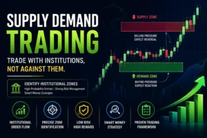
Stock prices don’t fall forever. Eventually, enough buyers wake up and say “that’s cheap enough” and start buying. That’s support—a price level where buying shows up consistently. Reliance Industries bounced off ₹2,200 multiple times before buyers finally quit showing up below that level. That’s the real story.
Resistance works the same way in reverse. After climbing higher for weeks, a stock hits ₹2,400 and can’t break through—not once, not twice, but three times. That’s resistance telling traders “nobody’s willing to pay more than this right now”.
The power comes from repetition. When price tests a level five times and fails each time, that level becomes so important that pros set their entire strategies around it.
Candlestick Patterns Tell Stories
Candles that form at turning points mean something—really mean something. HDFC Bank touched ₹1,200 and bounced immediately, showing up as a Hammer pattern. That single candle said “sellers tried hard but buyers came back.” The next week, it popped to ₹1,250.
Morning Star patterns appear after downtrends when exhaustion kicks in. Dark Cloud Cover patterns form when what looked like winning keeps falling—literally clouds covering yesterday’s gains. These aren’t random formations. They’re market psychology shown on paper.
The catch? Patterns only matter when they sit at important price levels. A Head-and-Shoulders pattern near a resistance zone carries more weight than one forming in the middle of nowhere.
The Real Indicators That Work
RSI (Relative Strength Index) swings from 0 to 100. Above 70 means “lots of buying just happened”—potentially too much. Below 30 means “lots of selling just happened”—potentially creating opportunity. That’s it. Simple. Yet most traders use RSI expecting magical signals.
Moving Averages smooth out the daily noise. The 50-day moving average shows what average prices looked like over the last two months. When the stock price sits way above it, that’s worth noticing. When it drops below suddenly, something shifts.
Volume separates real moves from fake ones. Stock bounces and volume stays dead? Sellers aren’t done yet. Stock breaks upward on heavy volume? That’s conviction.
Trading Mistakes Kill Accounts
Traders lose money primarily through this single error: fighting the bigger trend. Searching for short-term trades while the market’s really in a downtrend creates losses after losses.
Over-relying on single indicators backfires constantly. One indicator saying “buy” while price action says “no” creates confusion. Combining tools makes sense—combining everything makes paralysis.
Traders also chase markets after big moves have already happened. By the time news breaks and price jumps 5%, the real move’s over. Waiting for pullbacks lets traders enter smarter positions.